 Skip to content
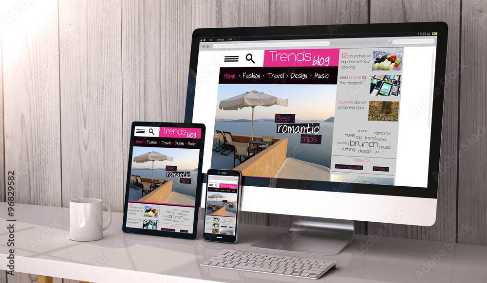
Responsive Website Design
TAKE YOUR BUSINESS TO NEW HEIGHTS WITH OUR RESPONSIVE WEBSITE DESIGN SERVICES
What is Responsive Website Design?
A website that effortlessly adjusts to multiple devices is now a must in the modern digital world, not simply a luxury. I present to you a responsive website design. This cutting-edge method of web creation guarantees that your site appears and performs beautifully on every screen size, whether it is a desktop, a tablet, or a smartphone. Considering that mobile devices currently account for over 50% of all internet traffic, undervaluing the value of responsive website design might harm your online visibility.
SEO Optimized Business Websites
Advertise your business online with our responsive and mobile friendly Search Engine Optimized Business Websites.

Search Engine Optimization
Have your business website optimized & advertised by professionals. Choose GoMaxPro as your SEO Company and take your business to new heights with our advanced search engine optimization and web development services.
Talk to a Digital Marketing Specialist Now! 800.890.2436


The Importance of Responsive Website Design
In today’s mobile-first environment, it is essential to have a responsive website design. It is crucial to provide customers with a fluid surfing experience across all platforms due to the growing popularity of using smartphones and tablets to access the internet. In addition to increasing customer pleasure, a responsive website boosts your website’s search engine rankings. Having a responsive design may provide you with a competitive advantage and increase your organic traffic since search engines like Google favor mobile-friendly websites.
Do you have a Question?
Talk to a Technical SEO Specialist Now! 800.890.2436
ADDITIONAL DIGITAL MARKETING SERVICES WE OFFER
Local Google Ads Management
Page Speed Optimization
PPC Management Services
Enterprise PPC Management
Enterprise SEO Services
Ecommerce SEO Services
Ecommerce PPC Services
On-Page SEO
Technical SEO Services
Link Building Services
Search Engine Marketing
Custom Website Design
WordPress Website Design
SMS Marketing Services
VPS & Dedicated Server Hosting
Content Writing Services
Blog Content Optimization
SEO Audits & Reporting
Ready To Sell Online?
Start selling online with our responsive and mobile friendly E-commerce websites.

The Evolution of Website Design
Since the beginning of the internet, website design has advanced significantly. Websites used to be built using predefined layouts that were suited for desktop displays. However, with the popularity of mobile devices, web designers had to come up with fresh approaches to make websites usable and aesthetically pleasing across a variety of screen sizes. As a result, responsive website design was created, enabling websites to adjust to the user’s device and provide the best viewing experience.
Both organizations and consumers may greatly profit from responsive website design. First of all, it guarantees that consumers can easily view your material on any device, eliminating the need for scrolling or zooming. This improves the user experience and motivates visitors to remain longer on your website, which increases the likelihood that they will convert. Responsive design also does away with the need for distinct mobile and desktop websites, saving you time and money on upkeep. Additionally, it speeds up site loading time, which is important for keeping people on your page and lowering bounce rates.
Key Elements of Responsive Website Design
There are various crucial components that must be taken into account in order to develop a responsive website. Flexible grids are first and foremost necessary for responsive design. They enable the material to modify and reorganize itself in accordance with the size of the screen. Depending on the device’s screen width, multiple styles and layouts may be applied using CSS media queries. In order to guarantee quick loading times and an aesthetically attractive experience, images and media must also be adapted for various devices. Additionally, typography has to be scalable to retain readability on various screen sizes.
Do you have a Question?
Talk to a Page Speed Optimization Specialist Now! 800.890.2436

BUSINESSES WE WORK WITH
Professional
Physical Therapists, Dentists
IT Services, Computer Security
Engineering Firms, Architects,
Social Media Agencies, Insurance & Real Estate Agents, Internet Marketing Services, Doctors, Lawyers, Solar Installation Contractors
Contractors
Contractors, Plumbers, Painters
Cleaning Services, Pest Control
Handyman, Wood Working
Pressure Washing, Interior Design, Home Remodeling, Roofing & Flooring Contractors, Luxury Transportation, Landscape & Hardscape Installations
Specialty Trades
Glass, Window & Doors Repairs
Demolition Contractors, Deck Builders, Concrete Contractors, Auto Glass Repair & Replacement, Car Dealership, Moving Companies, Notary Services, Auto Body Shops, Car Mechanics, Locksmith Services and more
How to Create a Responsive Website Design
This will enable you to rank the capabilities and design components according to their importance to your consumers. The next step is to develop a flexible grid structure that will enable your content to adjust to various screen sizes.
Then, depending on the width of the device, multiple styles may be applied using CSS media queries. For quicker loading speeds, it’s crucial to optimize pictures and media. Finally, to make sure your responsive design functions correctly, extensive testing across a variety of devices is essential.
Testing and optimizing responsive website design
It’s crucial to properly test your responsive website design across a range of devices and screen sizes once you’ve finished building it. This will make it easier to see any problems or contradictions that need to be fixed. Tools for testing responsive design that replicates various devices and screen resolutions include browser extensions and emulators.
Making changes in response to user comments and analytics information is part of optimizing your responsive design. The performance of your website should be regularly monitored, and any required adjustments should be made to keep your responsive design current.
Common Challenges in Responsive Website Design
Although flexible website design has numerous advantages, there are also some drawbacks. Prioritizing and simplifying material for smaller displays is a regular difficulty. The most crucial data and features must be taken into account and made readily available to mobile consumers. Dealing with the capabilities and limits of various devices is another difficulty.
It’s critical to provide backup choices or alternate solutions since certain devices may not be able to handle specific features or technologies. Additionally, because various browsers may read CSS and HTML code differently, cross-browser compatibility might be difficult. To provide the same experience across all browsers, extensive testing and debugging are required.
Examples of Successful Responsive Website Designs
To improve the user experience and increase conversions, several websites have successfully embraced responsive designs. One prominent example is Airbnb, which adjusts its design and content for various devices without any noticeable lag. Regardless of the device being used, its flexible design guarantees that consumers can quickly search for lodging and make reservations.
Another example is Starbucks, whose mobile-friendly website design enables visitors to look for local locations, browse menus, and make mobile orders. These websites serve as examples of how responsive design can provide consumers with a smooth and interesting experience across a variety of devices.
Benefits of Responsive Website Design for Your Business
A website that effortlessly adjusts to various screen sizes and devices is essential for the success of your company since more and more people are using smartphones and tablets to access the internet. A responsive website design has several advantages for your company. The user experience is improved in the first place. Visitors are more likely to explore your material for longer periods of time, make purchases, complete contact forms, and subscribe to your newsletter when they can quickly navigate and engage with your website.
Why Responsive Website Design is Important for Businesses
In the current digital era, having a responsive website design is essential for organizations. It guarantees that your website is usable and accessible on all platforms and screen sizes. A smooth user experience must be offered regardless of the device being used, since more and more people are utilizing smartphones and tablets to explore the internet. To provide your visitors with the greatest experience possible, a flexible website design enables your website to adapt and change its appearance, content, and functionality.
Improved User Experience and Customer Satisfaction
The enhanced user experience that a responsive website design provides is one of its main benefits. Visitors are more likely to remain longer, examine your material, and take the intended action when they can simply navigate and engage with your website.
Your website will be simple to read, browse, and engage with on any device thanks to its responsive design. Users won’t have to continually zoom in and out or scroll horizontally to access your content, thanks to this. You can boost client happiness and promote return business by offering a flawless user experience.
Increased Mobile Traffic and Accessibility
Mobile traffic has significantly increased as a share of total web traffic as a result of the increasing usage of smartphones and tablets. You can reach this expanding mobile audience and make sure they can visit your website by having a responsive website design.
Increased mobile traffic, greater engagement, and ultimately more conversions for your company may all be a consequence of this accessibility.
Better Search Engine Optimization (SEO) Rankings
When you have a responsive website design, search engines can crawl and index your website more easily since it has a single URL and consistent information across all devices. As a consequence of this increased exposure, your website may rank higher in search engine results and consequently get more organic visitors.
Cost-Effectiveness and Time-Saving Benefits
Your firm may save money and time by investing in a responsive website design. A responsive design enables you to have a single website that automatically adjusts to various screen sizes, rather than building and maintaining separate desktop and mobile versions of your website.
By doing so, the necessity for duplicate material is removed, and managing several websites takes less time and effort. You may also save time and money by making updates and modifications to a responsive design just once, and they will be mirrored on all devices.
The Impact of Responsive Website Design on Conversion Rates
The conversion rates of your company might be significantly impacted by a responsive website design. Visitors who like using your website and find it simple to browse and engage with it are more likely to complete the required action, such as making a purchase, completing a contact form, or signing up for your newsletter.
A responsive design removes conversion-blocking factors like challenging navigation and difficult-to-read information and motivates them to interact with your company. You can improve conversion rates and eventually generate more income for your company by offering a smooth user experience and making it simple for visitors to take action.
Key Features and Elements of a Responsive Website Design
There are a number of essential features and components that you should think about including in your responsive website design. These consist of:
Fluid Grid System: With a fluid grid system, your website’s layout may change depending on the size of the device being used to view it.
Images and media that are adaptable should be able to scale according to the screen size.
Media queries: Media queries let you use various styles and layouts depending on the device’s capabilities and screen size. By doing so, you may alter the user experience and adapt your website to various devices.
Simple Navigation: On all devices, navigation should be simple to use and intuitive. To make links and buttons on mobile devices easier to click, think about utilizing a hamburger menu.
Content that is Easy to Read and Accessible on All Devices: Content should be clear and readable. To guarantee readability, use readable typefaces, suitable font sizes, and enough spacing.
Forms that are mobile-friendly should be included on your website, if there are any. To make filling out forms simpler, use responsive form components and think about employing autofill options.
Tools and Resources for Implementing Responsive Website Design
Although putting into practice a flexible website design may seem difficult, there are numerous tools and resources that may assist you. Here are a few you may want to think about:
Bootstrap: A well-liked front-end framework, Bootstrap offers a variety of already-built responsive components and styles. Making a responsive website design is made easier by it.
CSS Frameworks: Responsive grid systems and other components are also available in CSS frameworks like Foundation and Bulma, which are simple to include on your website.
Use testing tools to make sure your website is responsive and mobile-friendly across a range of devices, such as Google’s Mobile-Friendly Test.
Responsive Design Checkers: You may also use online tools to examine how your website appears and performs across a range of gadgets and screen sizes.
You can effectively develop a responsive website design and provide your visitors with a smooth user experience with the help of these tools and services.
The Future of Responsive Website Design and Its Impact on Businesses
Any company hoping to succeed in the digital era would be wise to invest in a responsive website design. It makes sure that users have a good experience, raises search engine ranks, and ultimately increases conversions. Having a website that adjusts to various screen sizes and devices is essential for the success of your company, given the rising popularity of mobile devices.
You can boost customer happiness, get more organic visitors, and ultimately generate more sales by offering a flawless user experience. So, make your website responsive right now to reap the rewards.
An adaptable website design provides a plethora of advantages for your company, from higher mobile traffic and better search engine optimization (SEO) results to a better user experience and customer satisfaction. Don’t put it off any longer; make your website responsive right now and enjoy the advantages it offers.
Conclusion
In the modern digital environment, responsive website design is crucial. It is essential to provide customers with a smooth surfing experience across all platforms due to the growing popularity of mobile devices. In addition to increasing customer pleasure, a responsive design improves your site’s search engine rankings.
Understanding the value of responsive design and putting the major components into practice can help you build a website that engages users regardless of the device they use to view it. If you want to maintain your competitive edge in the digital sphere, adopting responsive design is a strategic decision that cannot be disregarded.
Do you have a Question?
Talk to a Digital Marketing Specialist Now! 800.890.2436
Request Formal Quote